Bridge Users (Hop Protocol)
Q1. How many unique users have bridged to L2s using Hop? What days in the past 6 months have seen the most volume bridged, and were there any specific events that may have driven these spikes? Which assets have been bridged the most? Show an analysis of the asset distribution of bridging through Hop.
Introduction and methodology
This dashboard will investigate the following aspects of the Hop Protocol:
-
How many unique addresses have bridged to L2s using the Hop Protocol?
-
How many transactions have been done on a daily/weekly basis on Hop, and how does this count compare to the number of unique addresses? In other words, is every user making just one transaction or many more transactions?
-
What is the daily/weekly amount of USD bridged using Hop?
-
What is the average amount of USD bridged per transaction?
-
Which assets have been bridged the most on Hop? [I was not able to get this data directly from Flipside, and hence for this last part, I have decided to use the data from the Hop Protocol Dashboard]
What is Hop?
Hop is a platform that allows users to transfer tokens quickly and easily between layer-2s, side chains, and layer-1 Ethereum. A two-pronged approach is used in Hop for the purpose of providing a scalable token bridge for Ethereum’s layer-2 ecosystem:
-
hTokens are a special intermediary asset that can be moved quickly and economically between networks.
-
hTokens and layer-2 assets can be traded using automated market makers (AMMs).

We can see that there have been many transactions done using Hop since its inception. What is interesting is that there are some major spikes on certain days, such as on June the 1stm, where the number of transactions made skyrockets to almost 700 transactions. Furthermore, there are also some spikes in the number of unique wallets, such as on April 30th (the most recent spike), December 30th 2021, or on October 10th 2021. What could these spikes be caused by? There are many potential reasons, such as speculation in the market or any significant and sudden interest caused by someone tweeting about the protocol. I have decided to look only at the data and what we can see from it - therefore this dashboard won't be digging to find any tweets or correlations for what the spikes have been caused by.
How many transactions is each user making?
I thought it will also be interesting to show that the ratio between the number of transactions and the number of unique users is not 1 to 1. This means that every user, on average, is making more than one transaction - which is good news for Hop!
We can see that on some days, such as very recently on June 1st, there have been 693 transactions made, which were made only by 127 users. This means that on average, each user made almost 5.5 transactions on that day. However, there have also been days where this ratio is moved in the opposite direction - in other words, on days such as May 1st, we can see 97 transactions made by only 47 users, meaning that the average number of transactions drops to only around 2 per user.
The next step is to look at the money side... How much USD has been bridged using Hop?
The two charts above show us that there have been some massive spikes in the amount of USD transacted on Hop. For example, on June 13th, over $8M has been bridged! By looking at the second chart, it is quite clear that the average amount of money bridged per transaction on Hop is quite constant. This follows what we would logically expect - the more transactions there are, the more money is bridged.
I thought that it would also be interesting to see how strong the correlation is between the number of unique users and the amount of money they bridge using Hop. We can see here that there are some days where the number of unique users grows massively, which in turn agrees with the fact that the more users transact on Hop, the more USD is being bridged. For example, on June 1st, we can see almost 700 unique users and over $7M bridged!
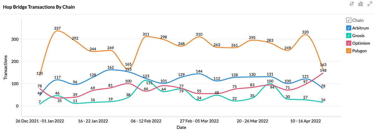
We can see that Polygon is the winner when it comes to which chain is the most popular on Hop. In fact, based on the number of transactions made, Polygon is the winner on every single day since the end of last year - no other chain had made more transactions than Polygon!
We can also see that Arbitrum follows Polygon and is the second most popular chain on Hop, followed by Optimism in the third place and Gnosis in the fourth and last place.
Let's now look at which assets are the most popular ones on Hop.
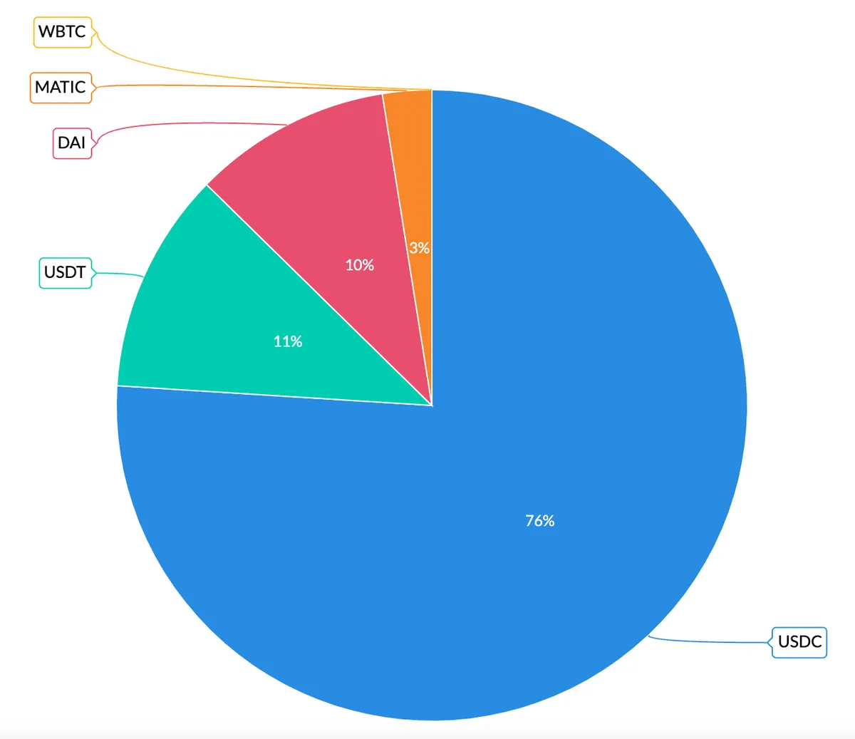
Stable coins for the win!
We can see that USDC has a major dominance over other assets that are being bridged on Hop, with 76% of the transactions being USDC ones. The second most popular asset is USDT with 11%, followed by DAI with 10% and MATIC with only (sadly) 3%. I'm quite surprised that MATIC only consists of 3% of the transactions, given that Polygon is the most popular chain, I would expect more users to transact with the native token of Polygon, but as we can see, this is not the case.
Conclusion
This dashboard has investigated how the picture for the Hop protocol is looking like. I have looked into the number of transactions as well as the number of unique users, together with the comparison of how many transactions are made on average per each unique user. I have also looked into how much money is bridged on Hop, and how this amount looks like per each transaction. Lastly, I have looked at which chains are the most popular ones on Hop, together with which assets have been bridged the most. Remember that this analysis has used a date_filter, so you can change the parameter in order to see how the data behaves in the weekly charts too - enjoy!