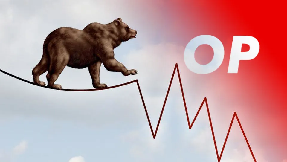
Optimistic Bears
Q9. Analyse Optimism during the month of July as markets were getting turbulent, showing whatever metrics you care to unearth.
Introduction
No one likes waking up to a red portfolio - especially when everything else around you seems to be collapsing. But seeing ‘red’ can also be taken as an opportunity by many users, who are keen to ‘buy the dip’ or bridge into new networks. This dashboard will analyse Optimism during the month of July by looking at a few different perspectives, as I investigate the following:
- The daily number of blocks as well as the average time difference between blocks, in order to understand the congestion on Optimism better.
- The top 15 tokens transacted on Optimism in July, in order to understand better which tokens gained the most interest from users as the markets were getting turbulent.
- Daily prices of the most popular tokens (except for stablecoins) in order to see which tokens increased in price - as well as to see if there is a correlation with the price of
WBTC. - The investigation of the Optimism bridge - how many inflows and outflows there were in July, by looking at transactions, daily unique users and USD bridged. Did Optimism see a lot of users leaving as markets were getting turbulent, or did users see this as an opportunity to join Optimism? (Read along to find out!)
- The number of swaps and swappers on Velodrome and UniSwap on Optimism in July, in order to see whether there was a big decrease (or increase) in the popularity of the two most popular DEXs of Optimism.
We can see that users were mostly transacting with USDC, which is what we would expect during a bear market - users were full of fear to invest into riskier assets, so it makes sense to see stable coins such as USDC, sUSD or DAI getting a lot of transactions. Following stables, we can also see a lot of popularity of the OP token, which has been increasing in price by a big margin in the month of July - which is great news for Optimism - after-all, it is the native token!
The scatter charts also reinforce the idea that a lot of users were leaving in the beginning of the month, but a lot of users were joining later down the line. I think that overall we can see that the less fear there was in the market, the more users were bridging into Optimism, which in turn increased the OP price and the USD volume bridged.
The two graphs above tell us that the most congestion on Optimism occurred in the later days of the month, with the biggest number of blocks used on July 29th. It is interesting to see how this translates to the average time between blocks, as we can see a clear inverse relationship between these two graphs. As more blocks were being used later in the month, the time difference between each block has been gradually decreasing on average. Therefore, it is nice to see that as the markets were picking up in volume later in the month, more blocks were being executed on Optimism - which means one thing - more transactions and more users! The next step is to look at what these users were doing - let’s look at the most popular tokens on Optimism in July next.
I thought that it might be interesting to add a scatter chart that shows the price of the popular OP token coloured by the price of WBTC. What is the insight that we can spot here? It is quite interesting to see whether a price of a token is influenced by the price of another token. As we all know, WBTC tends to pull markets up or down, so during the times when markets were getting turbulent, a lot of users looked to this exact chart. What we can see here is that the biggest increases of the price of the Optimism’s native token were closely correlated to WBTC’s price going up. This in turn implies that a lot of users could have been waiting for a confirmation in the market that the bear market is soon to be over, which caused them to buy the OP token, which in turn increased massively its TVL and hence its value.
The next step is to look at bridges… The next section is the biggest section of this dashboard, and will investigate the inflowing and outflowing metrics to and from Optimism - enjoy!
\
Key points:
- Optimism has seen a lot of transactions into the network, and fairly few outgoing transactions, which is quite interesting to see, as it is not exactly what we would expect during turbulent times.
- The ‘difference’ charts which show the difference between incoming and outgoing transactions and unique users both stay positive throughput July, meaning that the INFLOWing transactions and users were always greater than the outgoing transactions/users - which is great news for Optimism!
- The USD amount bridged IN is also usually greater than the volume bridged OUT however there is a lot more volatility in this category. We can see days where a lot of money has been bridged out of Optimism, especially in the beginning of July. As markets were turning more green, we can see a lot more USD being bridged to Optimism.
- The final graph pretty much summarises all of the findings of this section, when it comes to analysing the briding situation on Optimism. We can see the constant demand here for the bridge in July, meaning that there were a lot of new users onboarding the bridge as well as users who used the bridge frequently. Furthermore, we can see the demand increasing later in the month, which again reinforces the idea that a lot of users used the turbulent times as an opportunity to join Optimism and bridge their assets there, or to ‘buy the dip’. 😎
The daily number of swaps and swappers on Velodrome and UniSwap agrees with the earlier findings - that the most action occurred in the later days of July. We can see quite a lot of swappers on UniSwap throughout the month, who executed a lot of swaps in total. However, Velodrome has been rather quiet in the early days of July, meaning that users were too afraid to swap their assets there - however, as the markets got more stable, the swapping has resumed its popularity in the later days of July.
Conclusion
This dashboard has looked into the Optimistic network from many perspectives. I thought that there are two ways of tackling this bounty - either doing a deep dive into one section/protocol, or providing an insight into some very key metrics in order to understand the full picture better. I have decided to take the second approach, and do a deep dive into what I consider to be the most insightful part - which is the bridging, as it tells us directly how many users have seen the value of Optimism by choosing it as their network, even when markets were getting turbulent. What we have discovered in this analysis is that a lot of users have taken these hard times as an opportunity to join Optimism, which was evident in the bridging numbers, as well as increases in some of the most popular tokens, such as OP.
There is not much more to say rather than to conclude this analysis, and hope that Optimism’s users will stay optimistic in the upcoming months!

\
- Dashboard by -nat-#4310
- Twitter:
- Data from FlipsideCrypto