Polygon vs Harmony
Q1. Draw a chart comparing Polygon with Harmony on the following metrics: - Average tx_fee - Average number of transactions per hour
Introdcution
For this Bounty, I will compare the performance of Polygon and Harmony based on the two given metrics, that is the average transaction fee and the average number of transactions per hour. I will also look at the TVLs of both of the networks and compare the number of unique addresses for both Polygon and Harmony.
Initial Comparison
Firstly, I thought it would be nice to have a look at what Polygon and Harmony are looking like based on their TVLs. Let's look at the data provided by DefiLlama.
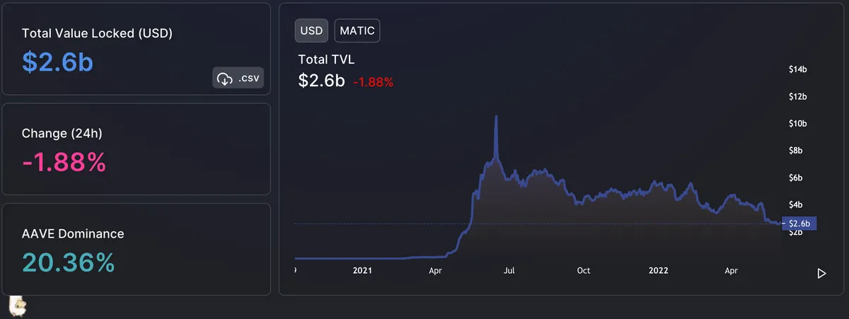
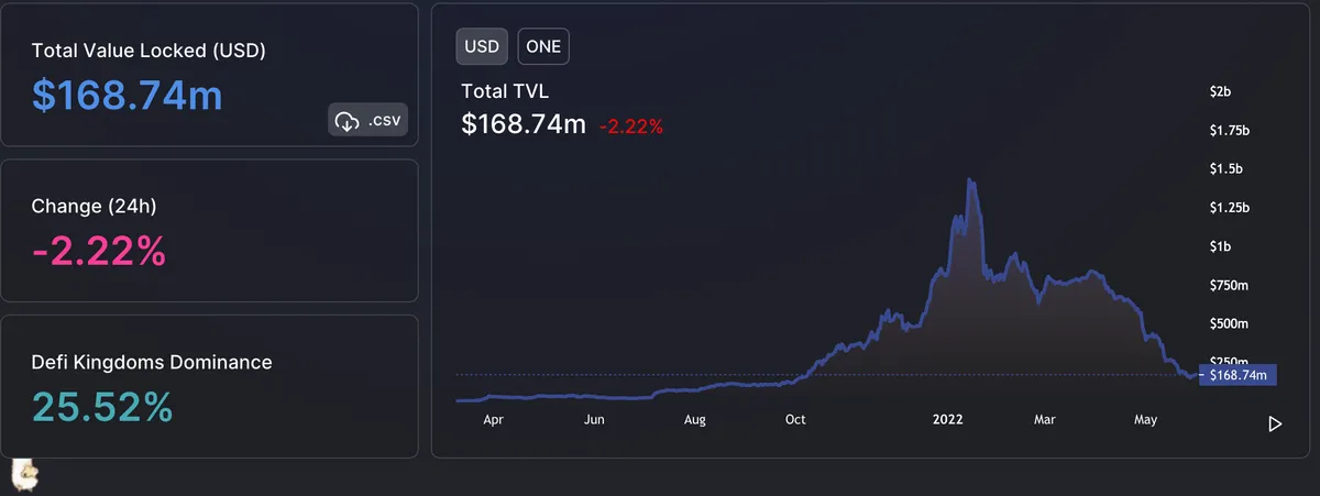
We can see that generally speaking, Polygon is doing much better than Harmony. Everyone would agree that Polygon is a much better-known chain, however, when we look at the trend of the TVLs, we can see that for Polygon it stayed almost constant in the past year, whereas Harmony has been declining since the end of 2021...
Firslty, we can see that the number of unique addresses has been increasing for Polygon, whereas even though there was a massive spike of new users in the Harmony network, it has been decreasing ever since the initial interest. What this shows me is that my initial assumption is correct - Polygon is a steady chain with new users onboaridng it every day, whereas Harmony onboarded new users initially, but has not kept its attracivness to the users few months after its inception.
What we can see is that the average transaction fee seems to be generally higher for Polygon than for Harmony. There are some periods where the Harmony's fees are higher, however, based on my judgement the Polygon's gas fees are higher for the majority of the time shown on this chart. To see this more clearly, let's look at the normalised area graph next.
This confirms the assumption made earlier - the fees are higher for Polygon for the majority of the time frame within this chart. We can see that lealty Harmony's fees have increased in price and have dominated Polygon - on days such as April 10th especially.
Even though the Bounty suggests to look at the hourly average number of transactions, I thought it would be nice to also look at the bigger picture. We can see here that the number of transactions has been bigger for Harmony ever since its inception - with an exception of a few days only. What this means is that users prefer to make transactions on Harmony - probably due to it having lower fees than what Polygon has to offer, as shown in the previous charts.
Lastly, by looking at the average number of transactions per hour, using a logarithmic scale, we can see the big difference between Harmony and polygon. It is clear that Polygon wins over Harmony for all three metrics included in this dhasboard.
Conclusion
It has been shown that even though the transaction fees are higher on average for Polygon than for Harmony, it is the preferred network for many users. The number of new addresses on a daily basis, together with the number of transactions made per day or per hour, are all a lot higher for Polygon than for Harmony. By looking at how the TVL is looking like for Harmony, together with the small number of new unique addresses, this does not look very optimistic for Harmony...