Velodrome Health (Redux)
Create at least 3 metrics on Velodrome with a description for each that showcase traction and success in a data-driven manner. Most importantly, the insights provided should help our readers answer the question "How healthy is this project?"
Introduction
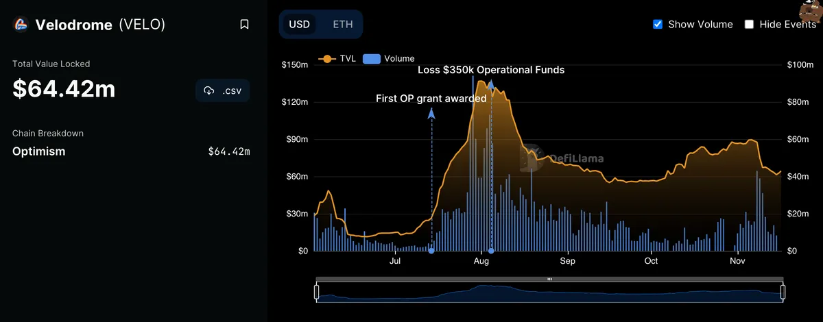
Velodrome has been gaining its popularity on Optimism - it seems like people are talking about it all the time. But how successful the platform really is? This dashboard will investigate a variety of metrics, in order to assess how healthy and successful Velodrome really is. We will look at some all-time values, and also zoom in to the past few weeks to see how much traction to Velodrome there has been. Given that it’s been a few months since the wallet exploit that happened at the beginning of August, it will be interesting to see how the interest in Velodrome has picked up ever since. Even though Velodorme restored all stolen funds after the attack, it will be interesting to see whether the event itself had any negative and long-term effects on the ecosystem. We also have to keep in mind the general situation in the markets. FTX just went down, people are afraid of what is yet to come… Keeping all of these factors in mind, let’s dive into investigating how healthy Velodrome is!

Key points:
- The daily number of unique users interacting with Velodrome seems to be increasing overall, which is good news - meaning that users see a lot of potential in the platform. We can see the number of active users spiking a few times in the past few weeks (especially on October 13th and November 11th 2022).
- The daily inflow and outflow volume in USD also tells us that Velodrome is a pretty healthy protocol, as we can see that the inflowing amounts are usually greater than the outflowing amounts.
- Users swap the most in the OP-USDC pool, which makes a lot of sense - after all OP is the native token of Optimism. We can also see that this agrees with the number of fees spent on swaps, as well as the fact that OP is one of the most swapped to and from tokens on Velodrome, and so are WETH and USDC.
Conclusion
This dashboard focused to answer the key question: how healthy is Velodrome? We have looked into some general metrics first, such as the number of transactions or the inflowing and outflowing USD volumes in order to get a general idea of how the project is doing. We have then deep-dived into which pools users mostly interact with, as well as which tokens are most popular and what are users doing, by looking at different actions. Having kept in mind the very recent events, we have asked the question of whether it had any negative effects on the ecosystem, and we have seen decreased activity levels - but we have seen that users stayed rather Optimistic - which only reinforces the trust users have in Velodrome, showing that overall, this is a healthy platform!
Key points:
- It’s great to see that deposit actions are vastly dominating the withdrawing actions from LPs. It means that a lot of os users are staying on Velodrome, which in turn implies that users believe that the platform is healthy.
- The action-focused chart tells us what most users are doing, and we can see that there are a lot of LP interactions, as well as swaps and claiming rewards actions. It is interesting to see the number staying pretty constant in the past weeks and not heavily decreasing, even after FTX went down. One could argue that there is no relation between FTX and Optimism, but we have to keep in mind the fear of users - and the fact that there is no visible ‘fear’ in most of these charts, only shows that users believe in the potential of both Velodrome and Optimism!
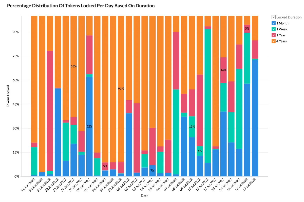
- (We can also see that a lot of users are locking their assets for the longest duration period, namely 4 years (graph taken from Analysis Of Velodrome Finance Locks) . If users trust the ecosystem to keep their money safe for such a long period of time, this could mean only one thing - that they believe the platform to be safe and healthy) - This insight was taken from the period when users were able to lock their assets.
- Users are also engaging in voting actions, we can see that a lot of votes have been recorded in the VELO-USDC and OP-USDC pools, both pools we have seen to be very popular on Velodrome by a number of transactions and users interacting with them.
\
- Dashboard by -nat-#4310
- Twitter:
- Refresh Rate - Daily
- Data from FlipsideCrypto