EVM - 1. A Surge of Optimism
What are the reason behind the changes in $OP Price, on this dashboard we'll look from differents perspectives to know which of them have an impact on the $OP Price, or if the $OP Price impacts on these these perspectives. Using An OP Price Analysis, Comparing OP Price against other Tokens Price, Comparing Growth Rate against other Assets Growth Rate, Comparing the LP OP FLOW against the OP Price, and finally looking at the Swaps and Swapper Activity Agains the OP Price.

A surge of (OP)timism!
> Optimism is a fast, stable, and scalable L2 blockchain built by Ethereum developers, for Ethereum developers. Built as a minimal extension to existing Ethereum software, Optimism’s EVM-equivalent architecture scales your Ethereum apps without surprises. If it works on Ethereum, it works on Optimism at a fraction of the cost. - Optimism Website
As explained by themselves, Optimism is an EVM which uses $ETH as their Gas Token, in 2022 they started airdropping their Native Token OP which is used as a governance Token in their Blockchain.
Some of the OP Airdrops are (by Airdrops):
- Optimism Users: Users who bridged to Optimism from L1 (Ethereum) during the early phases of mainnet (before Jun 23, 2021)
- Repeat Optimism Users: User who’re already elegible for the airdrop “Optimism Users” and made at least 1 transaction with an Optimism Application across four distinct weeks.
- DAO Voters: Address has either voted on or authored at least one proposal on-chain, or at least two on Snapshot (off-chain)
- Multi-Sig Signers: Address is a current signer on a Multi-Sig which has executed at least 10 transactions all-time.
- Gitcoin Donors: Address has made an on-chain donation through Gitcoin.
- Users Priced Out o Ethereum: Address bridget to another chain, but still made an app transaction on Ethereum each month after they bridged.
But these aren’t the only ways to adquire OP, multiples dApps built on Optimism received OP Grants to reward their Active Users.
Optimism in December
In December 20th, 2022 ==Optimism published their a review of 2022 in their Mirror page, some of the key points talked in the article are:
- A new Optimism codebase built to last called Bedrock, it will going live on Tesnet in January 12, and then a proposal will open to vote and decide to migrate Optimism mainnet to Bedrock in Q1 2023.
- Their Transaction Activity has increased 10x compared to the last Year.
- In Governance they talk about the creation of the Token House and the Citizens’ House a Grant Program to help the Optimism Ecosystem (People and Projects).
- Finally they say their goodbyes to 2022 with a public Mint for all the subscribers of Optimism Newsletter.
- The Mint is going to be available until the New Year (UTC)
OP During the FTX Crash
OP Price wasn’t excluded and during the FTX Crash their price also went down reaching a $USD Price below $1, but in the later days of December OP reached values over $1 Again,
So for this dashboard we’ll dig deeper and look for correlations between:
- OP Price and other Assets (BTC, VELO, FRAX, WETH) Price.
- OP Growth Rate and the Other Assets Growth Rate.
- VELO Is a good asset to compare against because both are Native from Optimism.
- OP Price and OP Netflow from the Top LPs from Velodrome
- OP Price and Swap Activity of OP in Velodrome.
- OP Price Predictions, using Support and Resistance Levels.
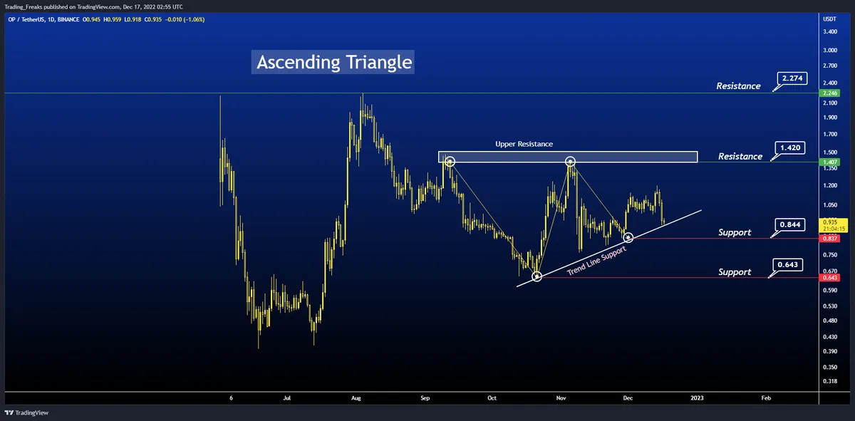

Optimism Native Token OP Price and Price Prediction by TheNewsCrypto Hannah Carter Analysis
Explanation of Ascending Triangle Pattern
> The above chart of Optimism (OP) laid out an Ascending triangle pattern. The ascending triangle is a characteristic pattern of an ==ongoing bullish trend==. This triangle is formed by a horizontal upper trendline that connects the highs and the lower trendline that connects the rising lows. If the trend breakout at the resistance level, the price will continue to move up in this ascending triangle pattern. From Website
Using these type of predictions we can get a general overview of the Price movement for OP, in case the OP continues their bullish it can reach a price of 1.420, instead if OP starts downtrending on Price it will reach a Support Price of 0.844.
This Analysis was published in December 17, 2022
And in the recent days, OP price has decreased reaching a Support in December 19 of $0.08796, after that the Price increases Again until a Resistance of $0.97 and the last support reached was $0.9022 in December 22.
Finally the Analysis from the web we can expect that $OP prices falls until reaching a support of $0.649 or Increase until reaching a Resistance of $1.420
Optimism Native Token OP Price against WBTC, WETH, FRAX and VELO Prices
Using optimism.core.fact_hourly_token_prices table to get the prices with symbol = WETH - WBTC - FRAX - VELO and then using Date Aggregation to get the daily with avg(price), then for the growth rate i used my SQL Recipe for Growth Rate in which i used the LAG() Function to get the previous day Value and then compare the current date Price against the previous day Price.
In a Single Query i use multiples CTEs to get the Daily Price and Growth Rate of Each asset and then joining all on Date.
🔎Price Correlation Analysis🔍
We can easily Notice that the OP Price Is Correlated with the Price of WETH, WBTC and VELO, FRAX Trend doesn’t correlate well against OP so we’ll skip from the analysis.
- The first price Spike in November 5 is really similar between OP and WETH/WBTC, in the case of VELO their spike comes day after.
- From November 6 until November 9 the Prices of OP, WETH, WBTC and VELO goes in a downtrend.
- WBTC and WETH reached their Support Price in November 10, one day later than OP.
- VELO and OP reached their Support Price in November 9.
- In November 10 OP Price Increases until November 11 and then stays without change until November 14.
- There isn’t another Asset with the same correlation, VELO presents a correlated Increase but starts decreasing faster than OP.
- After November 14 the OP Starts Decreasing reaching their Lowest Value in November 20, this correlate with WBTC and WETH Decrease.
- From November 20 onwards OP and WBTC, WETH and VELO presents the same trends, but it’s seems that OP Price is having a better trend that their pairs.
🔎Growth Rate Correlation Analysis🔍
Frax doesn’t have a good correlation with OP, but we can see that the Growth Rate of OP Correlates in most of the days with the Growth Rate from WETH and WBTC, with the OP Growth Rate being higher than the rest of Growth Rates.
- OP growth rate Against BTC and ETH growth rate doesn’t correlate only in November 15, here the growth rate for OP is Negative meanwhile the growth Rate for ETH and BTC is Positive, during the rest of the days these Assets growth rate is almost the same!.
- OP Growth Rate against VELO growth rate is less correlated but we can see that on some days both Assets reach the same Growth Rate like November 9 with almost the same Negative Growth rate.
- There are some days where the VELO Growth Rate is better than OP during the FTX Crash, but since December the Growth Rate for OP is bigger in “Absolute” Amount.
Top #3 Velodrome LPs with OP by OP Flow.
Because the Velodrome OP have higher amount of Swaps than Sushiswap i decided to only consider Velodrome Swaps. using optimism.velodrome.ez_swaps i created 2 ctes one for the Inflows and the other for the Outflows, using the contract address for the top 3 Pools in Swaps which are:
- #1 0x47029bc8f5cbe3b464004e87ef9c9419a48018cd USDC ↔ OP (883,368 Swaps)
- #2 0xcdd41009e74bd1ae4f7b2eecf892e4bc718b9302 WETH ↔ OP (375,278 Swaps)
- #3 0xffd74ef185989bff8752c818a53a47fc45388f08 VELO ↔ OP (213,167Swaps)
For the Outflows we multiply by -1 and then we selected joined both CTEs on Date and then we add both Inflow and Outflow to have the Netflow.
For the Netflows comparison i used all the queries in one, and then i add the OP Price as another CTE, finally joining all CTEs by Date
🔎LPs Analysis🔍
The three LPs swap activity correlated really well, although their total swaps aren’t the same, the distribution of Swap Activity is practically the Same.
The same happens to the OP Flows, most of the Volume is concentrated during the FTX Crash and then this amount becomes smaller on December.
But these charts are the Appetizer Only, the Main Dish Comes Now!
🔎LPs OP Netflow vs OP Price Analysis🔍
First the Netflow from USDC and WETH Pool correlates most of the days, the main problem is the VELO which their Netflow have differents values during the FTX Crash, and then in December starts to correlate with the other Netflows.
Although the Lines doesn’t correlate too well we can see a rule between the OP Price and the Netflow.
- When the Netflow Starts reaching Negative Amounts (a Bigger Outflow of OP From the Pool) the Price of OP increases, this can be seen during the first days of November, where the Outflow of OP starts increasing with the OP Price.
- When the Netflow Starts reaching Positive Amounts (A Bigger Inflow of OP From the Pool) the Price of OP decreases, in November 8 the Inflow of OP reached the spikes in the three LPs, and then the price of OP starts Decreasing with a bigger spike also.
So the OP Netflow show us how the OP Price will react the Day After, if there is a Positive Netflow in the day, the following day the OP Price will decrease, and there will be an Outflow from OP which will trigger an Increase of Price Again.
🔎OP Price vs Swaps with OP Analysis🔍
For the Total Swaps Activity, it’s seems that when the OP Price starts decreasing, the Amount of Swaps is bigger as indicated by November 9, and November 21 dates, After November, the Swap Activity and OP Price starts Correlating having spikes in the same Days.
The Amount of Distinct Swappers are really low, trading OP for other assets, but when the OP Price was at their spike, the amount of swappers was also at their Spike, in December they correlate more times.
The Same happens for the total $OP Volume Swapped, during the FTX Crash, when the price was at their lowest, the $OP Swapped was at their highest, but in December they started correlating better.
🔎OP Price vs Swaps TO OP Analysis🔍
Swaps with OP and TO OP are almost similar, so we can assume that a lot of people were swapping OP → X Asset → OP to win some of OP with Arbitrage Swaps.
Swappers receiving OP starts to increase when the OP Prices hit bottom, and after that when the OP Price starts to increase, the amount of Swappers also increased reaching bigger Amounts in December than November.
Again the Volume Chart is really similar to the one before, but the Volumes from OP Received are higher than before, when the OP Reach their first bottom price in November 9, the Amount of OP Received reached the biggest spike of 35M $OP, but when the OP Price reached their lowest price in November 22, the OP Received only reached 4M $OP, in November the Volume of $OP received is really low.
Summary
It’s seems that $OP price have the same trends as popular assets such as $ETH and $BTC, correlating really well on price and Growth rate.
- OP Growth Rate is bigger than $ETH and $BTC Growth Rate.
In the case of $FRAX their Prices never correlates, and for the $VELO another Optimism Token, they have differents price reactions during the FTX Crash, but in some days such as November 9, both tokens correlate really nice.
- OP Growth Rate starts to be better than $VELO in December.
Aside from the correlation on Prices and Growth Rates between Assets, we can see the following correlation between the Netflow from popular LPs having $OP:
- A ==Daily Negative Netflow== (Bigger Outflow of $OP) implicates ==an increase for the $OP Price== the next Day.
- A ==Daily Positive Netflow== (Bigger Inflow of $OP) implicates a ==decrease for the $OP Price== the next Day.
In the Case of Swappers and Swaps Activity, it’s seems that the $OP Price determine the Swap Activity.
- Volatile Changes of Price in $OP will result in Bigger Amounts of Swaps by fewer Swappers looking to win $OP doing Arbitrage Swaps between OP → Asset X → OP
- When the OP Prices reached their lowest Price, the Volume of $OP Received after Swaps will be bigger, than the Volume of $OP used to Swap.
Finally Using the ==$OP Price Analysis== we can expect that $OP Prices:
- Will reach $1.420 as the first Resistance.
- Will reach $0.649 as the first Support
Methodology and Personal Comments.
I decided to keep this Dashboard Short and Simple, because the main goal was looking for reasons behind the changes in the $OP Price, so i decided to use more Linear Charts which can easily show correlations between 2 differents metrics.
I think the Growth Rate and the Netflow charts are the key behind the answer for the Prices changes, the Supports and Resitances Prices provided by TheNewsCrypto Web also helps to know the lowest and bigger price $OP can reach.