Hop In the Pool


Introduction
Osmosis is a cross-chain automated market maker on Cosmos and has expanded its services to Polkadot and Ethereum-based tokens through integration with Axelar and Moonbeam. Its cross-chain swaps allow decentralized finance (DeFi) dApp developers to expand their reach between different blockchain ecosystems [Blockworks].
In other words, Osmosis is a DEX protocol, which means it uses smart contracts to determine the price of digital assets, to produce liquidity via a peer-to-peer (P2P) methodology, and to exact trades between users. This approach to an exchange platform is known as an AMM (a DEX protocol that prices crypto assets in liquidity pools) [Cryptopedia].
Osmosis is a layer one (i.e., base layer) blockchain with its own validator set that secures the chain through Proof-of-Stake consensus. The native token of the Osmosis network is OSMO [Seeking Alpha].
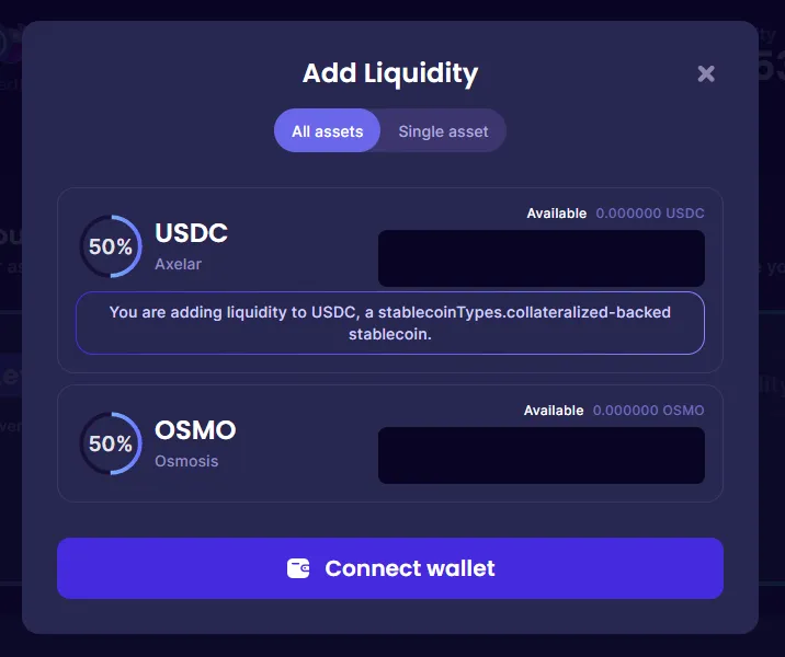
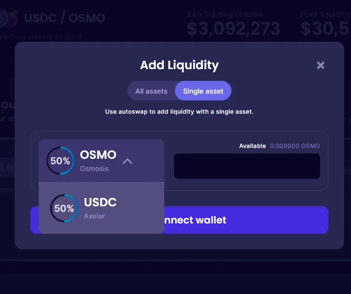
Osmosis has a liquidity pool per token pair. As a user, you can add liquidity to any pool. There are two ways to add liquidity:
- Single Asset: adding liquidity to one of the two tokens in the pool
- All Assets: adding liquidity to both tokens in the pool at once
> Note that if a user adds liquidity to multiple pool tokens in multiple transactions, this action does not count as an "All Assets" because it is not done in one transaction. > > \
In this dashboard, we study:
- Distribution of user liquidity addition type among users and tokens over time
- Distribution of swap size among tokens over time
Methodology
In this dashboard, We have used the osmosis.core.fact_liquidity_provider_actions table to analyze users joining pools and osmosis.core.fact_swaps to analyze swaps. We have used the transaction ID to identify how users have added liquidity to the pool. If the ID of two joins to the same pool is the same, We have considered it as "Dive in Headfirst (All Assets)" and other joins have been considered as “Wade in Carefully (Single Asset)”.
In this dashboard, We have analyzed the probability distribution of users’ join modes on the join features and also the central indicators of these distributions. The features of joins are of two categories:
-
Discrete Features: Features that are countable, such as tokens, pools, etc. For these features, We have modeled the distribution of the join mode on the feature and the distribution of the feature on the join mode as a categorical distribution.
-
Continuous Features: Features that are uncountable, such as the price, etc. For these features, We have modeled the distribution of the join mode on the feature and the distribution of the feature on the join mode by estimating the continuous distribution (using sampling).
-
Sequential Features: Features that are countable and sequential, such as time, etc. For these features, We have modeled the distribution of the join mode on the feature and the distribution of the feature on the join mode as a categorical distribution. Also, for these features, We have used the cumulative distribution function to analyze the derivative of changes in the join mode.
\
Joint Distributions of Join Modes and Join Features
As we mentioned in the methodology, in this section we visualize and analyze the joint distribution of join mode (All Assets, Single Asset) and join features. Since the visualization and analysis of the joint distribution is somewhat complicated, we use the conditional distributions of these two, relative to each other instead.
Joint Distributions of Swap Volume and Swap Features
As we mentioned in the methodology, in this section we visualize and analyze the joint distribution of (Swap Volume, Swap Count), and Swap Features. Like the previous section, since the visualization and analysis of the joint distribution is somewhat complicated, we use the conditional distributions of these two, relative to each other instead.
> Note that the price of the IOV token in October 2021 has a sudden jump, which is probably false. Its price has increased from 0.08 to 21000 in some days. Therefore, we have excluded this token from the analyses.
Highlight
The graphs on the left show the distribution of "Join transactions" and "Joined users" between the two join modes. It should be noted that a user can use both types of joins.
As can be seen in the graphs, most users and transactions are involved in "All Assets" joins. Therefore, in the following analysis, we should note that it is normal to have more "All Assets" transactions in the subsets of “join” transactions.
Highlight.
The graphs on the right show that:
- The diagram above shows the distribution of join times for each of the two join modes. As we can see, there is no "Single Asset" joins until December 2021. Osmosis has probably since added the possibility of this joining mode. You can also see that the use of both join modes has decreased over time, although the number of joins from the "Single Asset" mode has decreased less.
- The lower graph shows the changes in the Bernoulli distribution of the join modes over time. As we can see, since the start of using the "Single Asset" mode, the proportion of users who have used it has increased over time. So overall, over time, using the "Single Asset" mode has become more popular.
Highlight
The graphs below show the distribution of join modes based on the number and volume of joins, for each token. The top chart for each token shows what percentage of its joins are related to each of the joining modes and the bottom chart for each token shows what percentage of the volume of its joins is related to each of the joining modes.
Based on the observations from these graphs, it seems that stable tokens are more attractive to join "All Assets" than other tokens. To evaluate this claim, we will examine this issue in the next experiment.
Highlight
The two charts in this section are presented using the separation of stable coins from non-stable tokens. Among Osmosis tokens, we labeled "USD Coin", "Tether USD", "Dai Stablecoin", "TerraClassicUSD" and "Inter Protocol USD" as "Stable" and the other tokens as "None-Stable". The graph on the right shows the estimated joint probability distribution of "join mode" and "stability mode". As can be seen in the chart, the probability that a user will join a stable token as a "Single Asset" is close to zero. To ensure this result, it is necessary to use conditional distribution. The graph on the left shows the conditional distribution of "join mode" conditional on "stability mode". As we can see, the probability of using the "Single Asset" mode in stable tokens is about half of the probability of using it in None-Stable tokens. This change is very impressive and meaningful.
Highlight
The diagram on the left shows the “distribution of joining with each of the tokens” for each of the joining modes. As can be seen, osmosis is the most common in both cases. The reason is probably that in most pools, osmosis is one of two tokens. However, in the "Single Asset" mode, a higher percentage of “join” transactions are allocated to osmosis, which is very interesting. Because this issue shows that in many cases, users have preferred osmosis between the governance token of osmosis over the other token.
Highlight
The graph on the right shows the probability distribution of the logarithm of the volume (in USD) of join transactions for each join mode. This chart also shows interesting information. Both distributions are Gaussian. With the difference that the central indices of the distribution related to the volume of "Single Asset" joins are almost half of the central indicators of the distribution related to the volume of "All Assets" joins. Note that in an "All Assets" transaction, the liquidity of two tokens is increased, and in this diagram, each liquidity increase is counted once. Therefore, the probability of a user increasing the liquidity of "Single Asset" by any amount is equal to the probability of increasing the liquidity of "All Assets" by four times that amount. Therefore, it can be concluded that people who are looking to increase the liquidity of "All Assets" come to osmosis pools with about four times the capital. This point is very accurate and significant considering that the distribution of the volume of transactions has shifted by exactly "double" in almost all places.
Highlight
The graphs on the left show the trend of changes in swap indices over time. Each chart includes both the daily values of that index and its cumulative chart. These charts are:
- The above graph is related to the number of users who have swapped daily.
- The middle chart is related to the number of daily swap transactions.
- The bottom chart is related to the daily swap volume (in USD).
These three graphs show that:
- Between January 2022 and May 2022, all indices have increased significantly. However, after some time, their amount decreased, while they are still high compared to before 2022.
- During this time, the number of users and transactions has increased more than the volume of transactions. Therefore, it seems that the average volume of user transactions has decreased over time. We will evaluate this issue further using another experiment.
Highlight
We use these graphs to analyze the distribution of the volume of swaps:
-
The chart above shows the distribution of the volume of swaps in USD. As we can see, this distribution is Gaussian and its central indicators are around $30. However, its variance is high and volumes from 10 cents to 10,000 dollars have a significant probability.
-
After seeing the results of the above graph, we designed the middle graph to evaluate how the volume of swaps changed over time. This chart divides the volumes of swap transactions into 8 bins and shows how they change. As the chart shows, similar to what is seen in the Gaussian distribution, the probability of the middle bins is higher than the first and last ones. In fact, this chart shows that the volume distribution of swaps has followed the Gaussian distribution over time. According to this graph, we can conclude that over time, users' desire for higher volume swaps has decreased and lower volumes have become more popular. In such a way that swaps with a volume of more than $10,000 have decreased greatly (from around 2% at the end of 2021 to around 0.2%) and swaps with a volume of less than $10 have increased (from around 20% at the end of 2021 to around 50%).
-
The bottom chart is similar to the middle chart showing the distribution of swap volume in dollars. With the difference that the basis of its grouping was "token" instead of "time". In this chart, it can be seen that the distribution of the volume of swaps in tokens is very diverse. In the way that the volume of all KRTC swaps was below 10 dollars, while the volume of about 86% of the LUM swaps was above 100 dollars.
Conclusion
Osmosis is a cross-chain automated market maker. In Osmosis, you can increase liquidity and you can swap your tokens with each other.
Based on the analysis of this dashboard about Join transactions, we found out that:
- Most liquidity enhancement transactions use "All Assets" mode instead of "Single Asset". Also, more users use "All Assets" than "Single Asset".
- "Single Asset" mode was added around December 2021 and is getting more and more popular. However, it is still less popular than "All Assets".
- The percentage of the number of "Single Asset" transactions per token varies between 2% and 72%. Also, the volume percentage of "Single Asset" transactions per token varies between 0 and 93%.
- The relative use of "Single Asset" join in stablecoins is almost half of other tokens.
- Users, when using "Single Asset", are more interested in the Osmosis governance token than using "All Assets".
- Users who use "All Assets" increase liquidity in each transaction about four times than users who use "Single Asset".
Based on the analysis of this dashboard about the Swap transaction, we understood that:
- At the beginning of 2022, Swap on Osmosis increased significantly and then decreased. However, the use of Osmosis is still higher than in 2021.
- The logarithm of volume (USD) that users engage in each swap has a Gaussian distribution with a mean of around $30. However, the variance is high and transactions between 10 cents and 100 dollars are highly possible.
- The volume (USD) that users engage in each swap has decreased over time in such a way that from the beginning of 2022, the percentage of transactions below $10 and above $10,000 changed from 20% to 50% and from 2% to 0.2%, respectively.
- The logarithm of volume (USD) that users engage in each swap has almost Gaussian distribution for each token. However, its parameters are very different in a way that KRTC does not have a transaction above $10, while 86% of LUM transactions are above $100.