Starknet Mega Dashboard
StarkNet serves as a Layer 2 Validity Rollup solution to Ethereum Layer 1. Within this dashboard, we can access both basic and detailed metrics pertaining to StarkNet. Furthermore, by inputting any StarkNet account's address into the first parameter field, comprehensive statistics for the respective account can be displayed. I have included explanations for the various metrics where I deemed them necessary, ensuring clarity and facilitating understanding of the provided information.

The first graph displays the values of tokens in USD terms at the time of transfer.
The "Contract Deployments" graph tallies the number of contracts deployed with the key value: ["0x26b160f10156dea0639bec90696772c640b9706a47f5b8c52ea1abe5858b34d"]; ContractDeployed.
The "Users" graph counts the addresses that deployed with the following key values:
["0xd876503fb434f7517a7b4ae8d0d5fba27e2fa7b1a9f200deb935316f46fcc3"]; AccountInitialized ["0x17edf1120040be1bbc6931f143df1cc1cf80bb7f7fdadb251a3668ba3755049"]; account_initialized ["0x5b2a35ce7c22f7e57f3dc110736c0cbd97fc3014749fca084c4366eb9287f1"]; account_deployed ["0x1d9ca8a89626bead91b5cb4275a622219e9443975b34f3fdbc683e8621231a9"]; AccountCreated ["0x10c19bef19acd19b2c9f4caa40fd47c9fbe1d9f91324d44dcd36be2dae96784"]; account_created
The table at the left side showing number of unique addresses that made a transaction during the selected time frame


Before we get into the metrics, let me quickly explain the parameters provided above. The second one lets you choose the time frame for the charts - you can go with either 'Month' or 'Day' instead of 'Week'. If you want to zoom in on a specific time range, you can change the start and end date.
If you have any issues or cool ideas for new metrics, feel free to hit me up on discord, twitter, or telegram
The majority of the fees collected in the StarkNet ecosystem are directed towards Layer 1 to cover the expenses related to proof verification. Another portion of the fees is allocated to the sequencer. Therefore, the graph mentioned earlier can provide an indication of StarkNet's revenue. However, it is important to keep in mind that a significant portion of these Ethereum (ETH) fees are utilized on Layer 1 for various purposes.

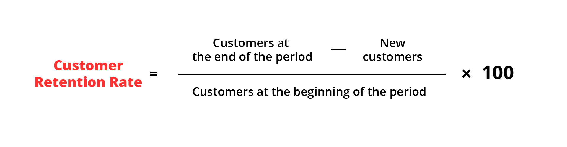
The table below is independent from the parameters we are seeing retention rate for last 12 Months

Now, we are going to see the top 25 gas ⛽️ spender dApps, in scatter chart form. In the chart below, the 'Y' axis represents the amount of gas spent through the dApps, and the 'X' axis shows the number of unique addresses that interacted with the contracts of the dApps, while the diameters of the circles represent the volume (USD equivalent of tokens that were sent to the contracts at transaction time) of the contracts. If you come across a familiar contract without a name, please let me know. For more detailed explanation, please visit the 'Kitchen of the Study' tab.
Now we are going to explore a chart called '100TILE,' which might be unfamiliar to those who are not familiar with data analysis concepts. Let me explain the concept of 'ntile' by sharing how I derived the '100TILE' (Number of Transactions) graph.
First, we counted the total number of addresses, which is 1.439 million at the time of writing.
Next, we divided this total number of addresses into 100 equal-sized groups, resulting in 14,390 addresses per group. This is what we refer to as '100TILE.'
We then proceeded to count the number of transactions made by each address.
After obtaining the transaction counts for all addresses, we sorted them in ascending order based on the number of transactions.
We divided these sorted addresses into batches of 14,390 addresses each, representing the groups or 'tiles' of the '100TILE' chart.
Now, let's imagine you are exploring the chart and encounter the following values: '100 TILE: 98' and 'Transactions #: 42.' This means that approximately 98% of the addresses fall into the first 98 tiles, indicating that they have made fewer than 42 transactions.
By examining the chart, you can gain insights into the distribution of transaction activity across the different tiles and understand how many addresses have similar transaction counts. It allows you to assess the concentration or dispersion of transaction activity within each tile.